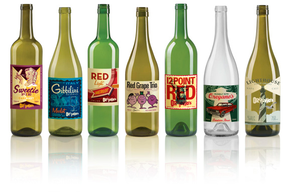
Wine label design is very personal – every wine brand has a unique story to tell. Often, this has meant that everyone was designing by the ‘seat of their pants’ with no science behind the decisions and no validation of what works.
Now, thanks to a December 2015 report by Nielsen, we have actual customer data to give us insight into what catches the eye (*and perhaps, why). This great research paper has comments and insights from individuals, but also scientific data that shows where the human eye goes on the shelf, and how long it stays there.
This behaviour can change over time, so this study will be repeated in the future, but for now, this data is a golden opportunity to put some science behind the highly emotional process of wine label design.
Here are the key points:
- In addition to gabbing consumers’ attention, the label must also convey certain key messages, points of differentiation from competition, and a distinct personality.
- 64% of consumers will try a product because the package catches their eye. 41% will continue to buy a product because they like the packaging.
- The wine category is crowded. 4,200 new wines were introduced in 2014.
- Consumers make most decisions at the retail shelf – the category is fragmented with little brand loyalty.
- Media spending is low relative to other commodities, so shelf appeal is even more important.
- Package design can also help gain distribution – labels appeal to restaurant owners and wholesale distributors too.
more on labelprintingportland.com


