From critters to curse words, the designs on wine labels have evolved from Old World sensibilities to social media-worthy sassiness.
But is it fair to judge a tipple by a winery’s twist on typeface or bent for bawdiness? Christine Sismondo traces the lineage of wine label design and explores why serifed fonts and dusty mansions have been replaced by hashtags and hippos (for better or for worse)
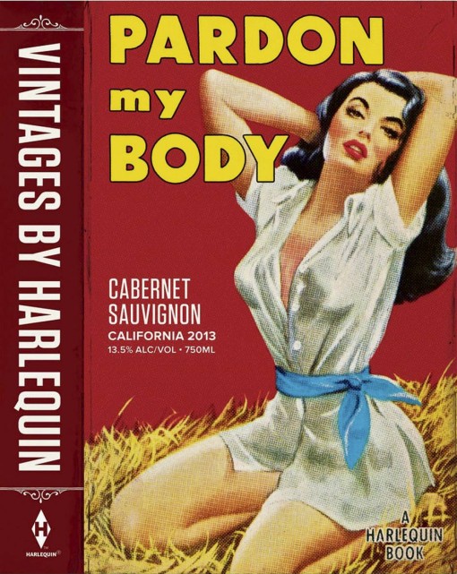
Pardon My Body has all the visual clichés we’ve come to expect from a mass-market romance – an under-dressed, Barbie-proportioned woman with full, ruby lips who is, for some reason, cooling off on a bale of hay.
“As she pressed her ruby lips to mine,” the blurb reads on the back, “I drank in ripe cherry, blackberry, boysenberry and a hint of cassis.”
If that seems oddly specific – or an instance of purple prose gone way too far, even for genre fiction – take heart. This isn’t jacket copy, it’s a wine label. In late September, Harlequin announced that it’s getting into the wine business, starting with the release of a cabernet (Pardon My Body), a red blend named Wild at Heart and Substitute For Love, a California chardonnay.
more on theglobeandmail.com


