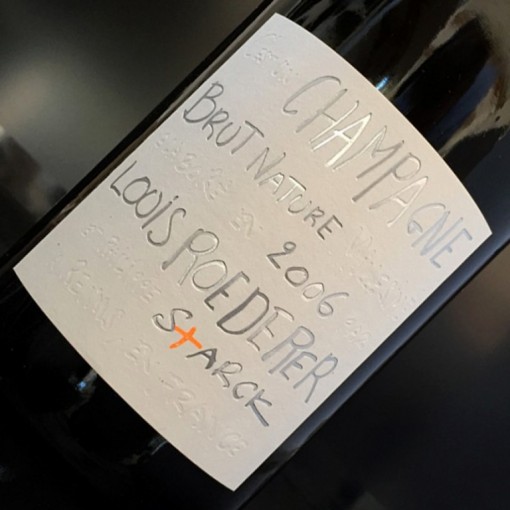
Champagne Louis Roederer’s release of its first “Brut Nature” wine, adorned with a minimalist label and a narrative that reads more “grower” than Grands Marques, has cracked open a discussion about the changing identity of Champagne and its values.
We’ve all been cautioned not to judge a book by its cover, and the same principle generally applies to wine. But who hasn’t bought a bottle based solely upon the image printed on the label?
Even if it doesn’t always indicate what to expect from a wine stylistically, label art exists for a reason: Whether in the form of a cupcake or the etching of a fancy chateau, it imparts some kind of story or message that informs our experience of drinking the bottle. Often, the idea isn’t so subtle. It might prove difficult, however, for the average drinker to decode the meaning behind a label like that of the celebrated Champagne firm Louis Roederer’s new 2006 “Brut Nature” bottling.
more on punchdrink.com


