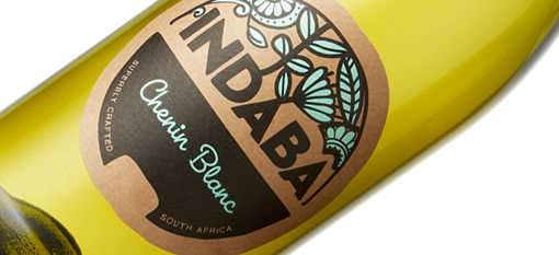
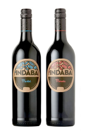
In redesigning the labels, capsules and carton, Cape Classics’ design team was inspired by the natural environment found on the southern tip of South Africa, drawing on the rich diversity of the Western Cape’s floral kingdom – the smallest, yet most diverse of the six floral kingdom’s on earth.
The color choices for each varietal were based on what one may see in the Cape – the slightly muted hues, the way the light falls on the mountains, and the sun-faded affect caused by the strength of the African sun. The rebrand also drew on the region’s strong commitment to sustainability by choosing a plain craft carton, that’s free of color or varnish.


